A refresh worth opening.
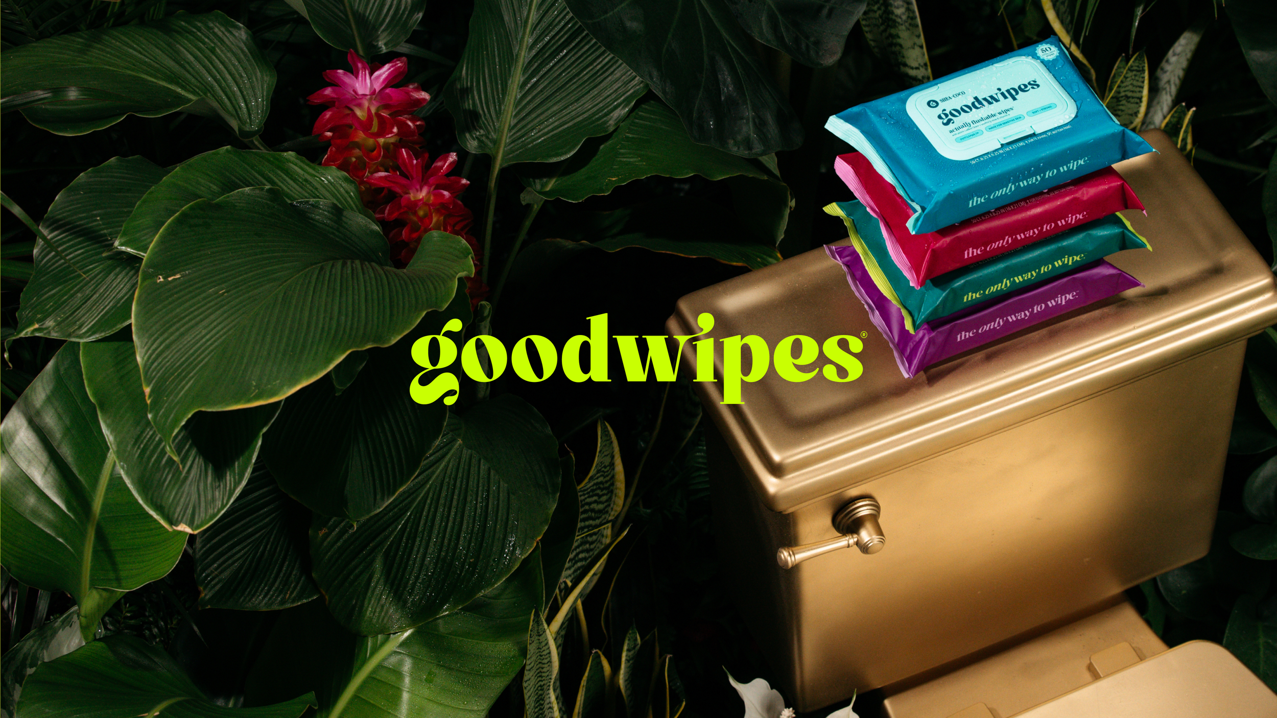
Goodwipes was in the middle of a brand refresh with a launch on the horizon, yet their email channel hadn’t caught up and product photography was still weeks away. They needed emails that could educate, build trust, and reflect their new elevated direction without relying on final visuals.
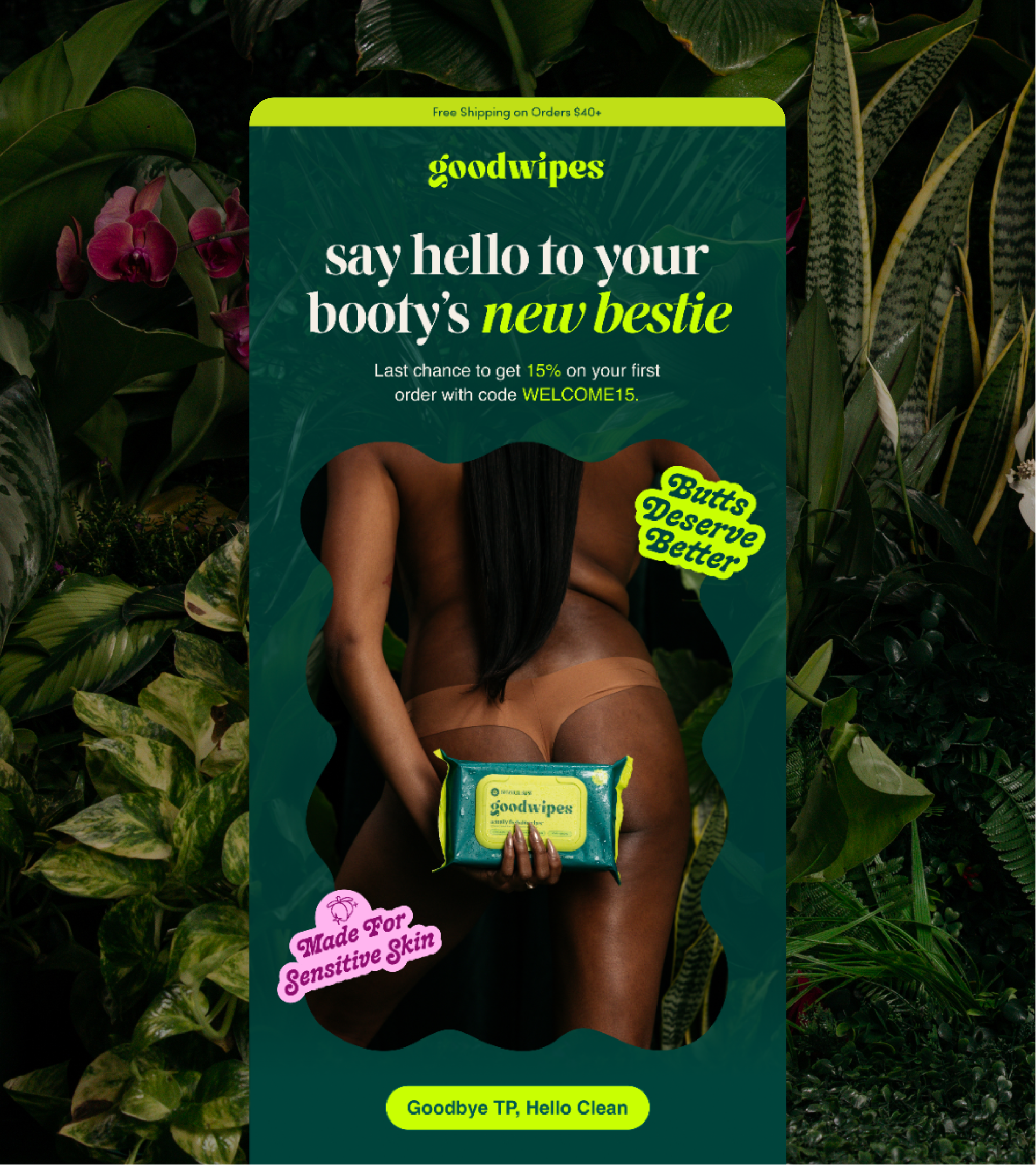
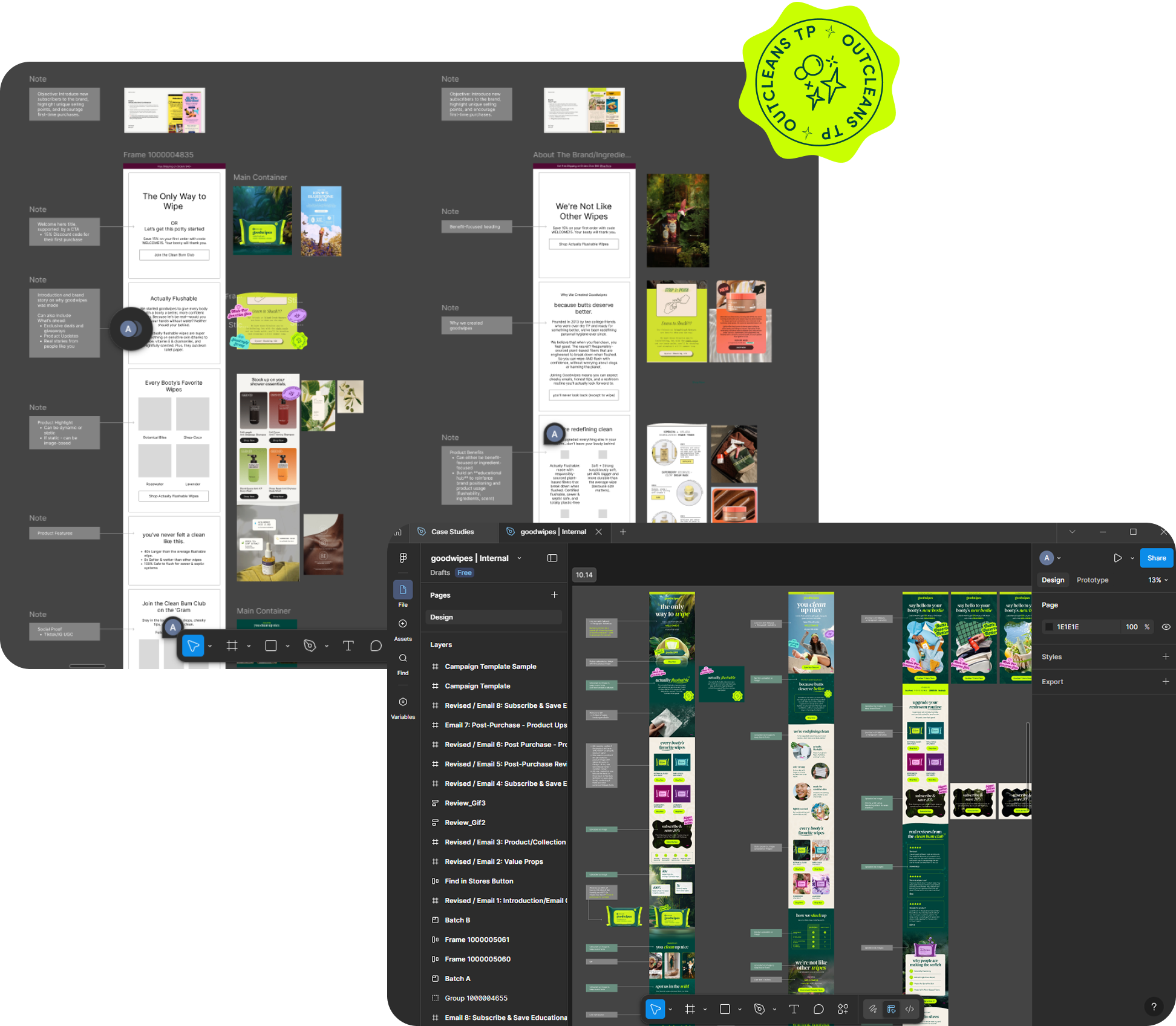
Together with Goodwipes and the Barrel team, we designed a flexible email flows that translated their refreshed brand into the inbox. Through clear structure, thoughtful copy, and adaptable design, we created emails that could launch confidently and evolve seamlessly as new assets came in.
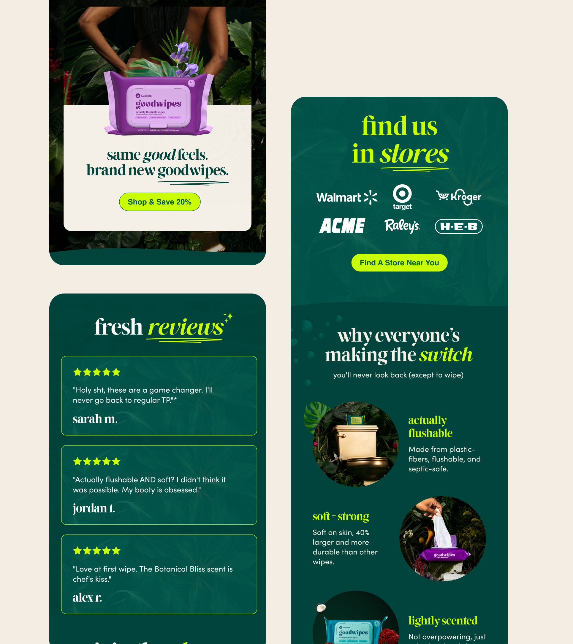
The result is a fun on-brand, and elevated emails to help Goodwipes connect, nurture, and educate their audience.
⬤ EMAIL DESIGN
⬤ KLAVIYO BUILD
The Process
We kicked off the project with research and discovery. We explored brands that collaborated with movies and released limited edition collections, drawing inspiration from their ability to tap into pop culture.
Drawing inspiration from brands that collaborate with movies and release limited edition products, we created a moodboard that captured the essence of Pop Cherry—what we called "Dork Punk." This moodboard helped set the stage for the playful, bold, and vibrant creative direction we envisioned for the brand.
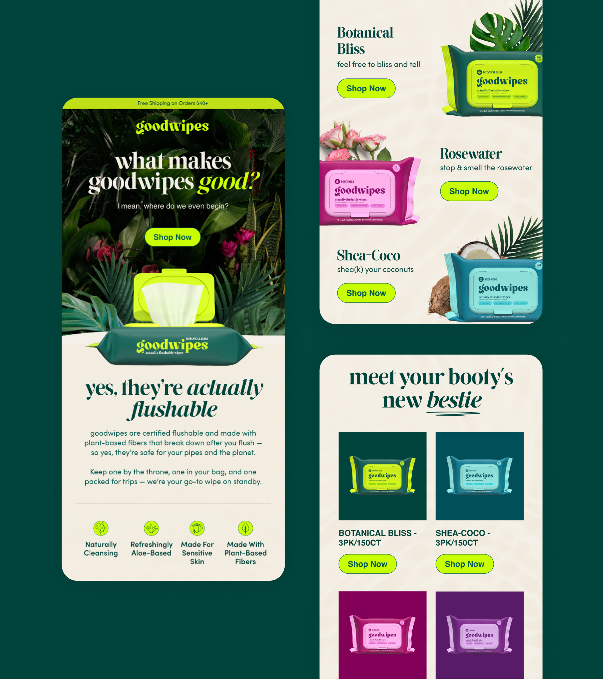
With the direction set, we rolled the system out across the remaining flows, refining copy to reduce scroll fatigue and sharpening clarity before uploading final assets to Klaviyo for launch.
The Outcome
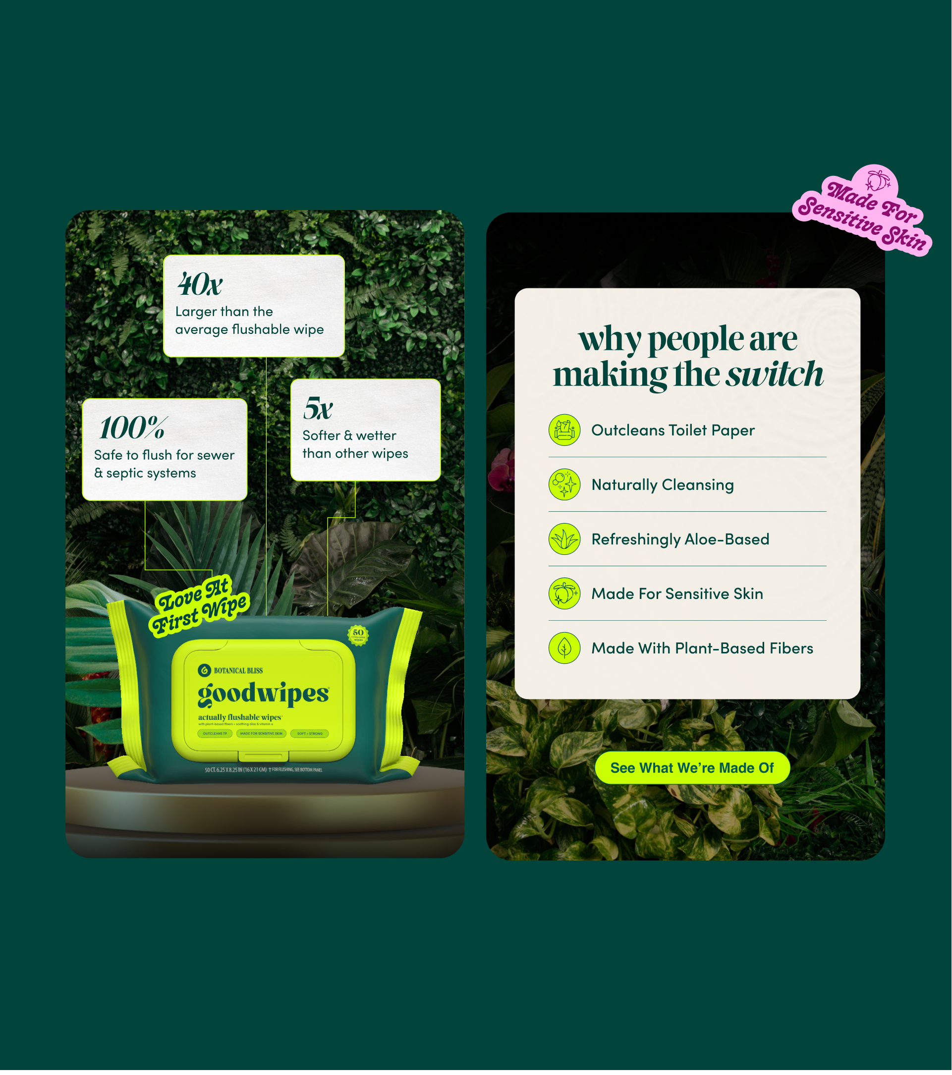
The result was a cohesive, mobile-friendly email flows that felt fun, elevated, and on-brand.
Each flow was designed to educate subscribers, highlight value propositions, offer rewards, and drive action with clear CTAs and above-the-fold offers.
By launch, Goodwipes wasn’t filling space in the inbox. They were showing up with intention, using email to reinforce trust, articulate value, and support their refreshed identity, even before every asset was finalized.


